シェアする
シェアする
Creating a New File - Japanese Only
みなさまどうも。
続きまして『新規ファイル作成』を行ってみましょう。
まずPhotoshopを開いてください。そしたら上のメニューバーに『ファイル』という項目があると思います。その中の『新規』をクリックしてください。そうすると新規ファイルの作成画面が出てきます。
ショートカットキーで行いたい場合はWindowsOSの方は『Ctrl』+『N』、MacOSの方は『command』+『N』で新規ファイル作成画面を出すことができます。
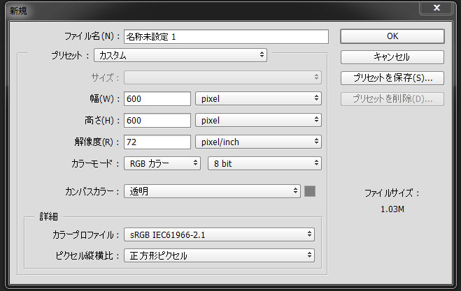
さて、こちらの各項目の確認です。ちょっと色々な項目があって難しい言葉がいっぱいですが頑張っていきましょう。
まず『ファイル名』という項目ですが、これは作成する新規ファイルの名前のことです。こちらご自由にお好きな名前をつけてしまって構いません。
続いて『プリセット』と『サイズ』という項目ですね。こちらは『A4用紙』などの規定の大きさで作成したい場合に選択すると自動的に画像サイズや解像度などを設定してくれます。
例えば『A4用紙』を作成したい場合は『プリセット』の項目を『日本標準用紙』に選択し、『サイズ』のところを『A4』とすれば『A4用紙』の設定で新規ファイルを作成してくれます。ウェブで主に使用する項目は『カスタム』と『クリップボード』ですね。『カスタム』は幅、高さ、解像度、カンバスカラーなどを自由に設定するよ、という項目になります。『クリップボード』は画像を右クリックでコピーなどをしてクリップボードに画像が保存されていた場合、その画像サイズの情報を自動で取得して新規ファイルを作成してくれる項目となります。これとっても便利です。
次は『幅』と『高さ』ですね。これについては自分が作りたい画像サイズを自由に設定して頂いて構わないのですが、ウェブ用の素材を作成する場合は単位を『pixel』に変更してから設定することだけ忘れないようにしましょう。
続いて『解像度』です。『解像度』って何?っていうお話なんですが、『解像度』とは画素の密度を示す数値で、一般的に『1インチの中に何個のピクセルが含まれるか』という基準で数値化しています。これがかなりややこしく色々な単位があり、『dpi』という単位が使われたり、最近では『ppi』という単位が使用されてたりしています。Photoshop上での単位は『pixel/inch』です。
『pixel』というのは色のついたドットの数を指すので『1px』という大きさは表示されるデバイスによって違いがあります。例えば普通の27インチフルHDのPCディスプレイの解像度は『82ppi』となりますが、『iPhone 6』だと『326ppi』というケタ違いの解像度となっています。イメージとしては『1インチの大きさの中に電球のような発光体が何個含まれているか』というような感じですね。この『解像度』の数値が高ければ高いほど画質が良いということになります。
そんでもってここが大切なところになりますが、Photoshopでウェブ用の素材を作成する場合の値は『72』で固定してしまって問題ありません。というか正直ウェブに関しては『解像度』の項目は結構なんでも良かったりします。というのもウェブ素材というのは基本的にディスプレイごしに閲覧されるものなので『解像度』は閲覧しているディスプレイの性能によって変わります。そしてHTMLやCSSでは『解像度』という概念は使用されておらず、全て『pixel』のみを基準として管理されています。
例えば昨今の高画質なスマートフォンに搭載されているretinaディスプレイ、シャープさんちのIGZOディスプレイ対策として『大きめの画像を作成し、それをCSSなどで適当に縮小してから表示させる』という手法が使われていますが、この小さくしたりする際に使用される基準の単位は『pixel』で『解像度』は概念すら存在していません。なのでウェブ用の素材に関しては『解像度』は気にしなくてOKです。『JPEG画像』、『PNG画像』、『GIF画像』をウェブ素材として書き出す際は『pixel』の大きさのみ意識するようにしましょう。
この『解像度』の項目が必要になるのはもっぱら印刷を行う場合です。『300dpi』以下だとちょっとぼやけて見えてしまうので印刷用の素材を作成したい場合は『300』以上の値を設定するようにすると調子良いです。こちらもプリンターの性能で左右されるところですが、昨今の家庭用プリンターでは『300dpi』以上の素材を余裕で出力できるので、家庭用プリンターをお持ちの方は試しに色々な解像度の写真とかを出力させてみると良いかもしれませんね。『解像度』について色々と掴めるかと思います。
続いて『カラーモード』の項目ですね。こちらウェブ用ならば『RGBカラー』、『8 bit』で固定でOKです。そして印刷用素材を作成する場合は『CMYKカラー』を選択しましょう。こちらも『8 bit』で問題ないかと思います。
『RGB』がディスプレイ用、『CMYK』が印刷用の色の表現方法となっています。なんで表現方法を変更しないといけないのかというと、ディスプレイは自身が発光して色を表現するのに対し、紙媒体は光を吸収もしくは反射して色を表現するという大きな違いがあるからです。『RGB』は光の三原色の赤、緑、青を基準とした色の表現方法で『CMYK』は色料の三原色であるシアン、マゼンタ、イエローとブラックを基準とした色の表現方法になります。注意点ですが『RGB』と『CMYK』では表現できる色の領域に大きな違いがあり、印刷用の素材を『RGB』で作成すると結構とんでもないことになるので最初の設定は間違えないようにしましょう。
『8 bit』と『16 bit』の違いは色をどれだけ細かく設定できるかどうかの違いとなります。一応人間の目は『8 bit』以上の色の変化を認識できないと言われているので『8 bit』で作業して色が足りないとかの問題になることはほぼありません。ただ超精密な加工や修正を行いたい場合は色をより細く設定できる『16 bit』にすると調子が良かったりするので作業内容に合わせて使い分けると良いと思います。
続いて『カンバスカラー』ですね。これは『カンバス』と呼ばれるPhotoshop上の作業領域の色を設定する項目となります。この項目を『白』にして新規ファイルを作成すると白い背景が敷かれた状態で作業を開始することができ、『透明』にすると背景が何もない状態から作業を開始できます。個人的にウェブ用の素材を作成する際の背景というのは逆に邪魔臭いので、『透明』で作業を開始することが多いです。こちらは作りたい素材の内容や好みに合わせて使い分けて下さい。
次は『カラープロファイル』です。『カラープロファイル』とは色空間の規格を変更できる項目で、国際電気標準会議(IEC)さんが定めた世界的な標準規格である『sRGB』というのを選んでおけばウェブ素材(RGB)の作成に関してはほぼOKです。
印刷用の『CMYK』で作業を行う場合は『Japan Color 2001 Coated』というのが一般的ですね。こちら『CMYK』を選択した場合のデフォルト値になっているはずです。こちらの項目は稀にプリンターで出力すると色が違ってしまう場合などに変更する項目となりますのであまり触ることはないかと思います。もし将来、印刷屋さんなどに印刷をお願いするときは「Photoshopで素材作成したいのですがカラープロファイルはどれがいいですか?」と聞いてみると設定について色々教えてくれると思います。
最後に『ピクセル縦横比』についてですね。0からウェブ素材を作成するならば基本的に『正方形ピクセル』で問題ありませんが、映像媒体からキャプチャを取ったり場合などに注意が必要です。映像素材は正方形ピクセル以外で構成されているが多く、ビデオテープなどからキャプチャをとってPhotoshopに取り込んだ際に歪んでしまったりしたらこの項目を変更しましょう。そうすれば多分直ります。
というわけで長くなりましたが各設定の解説は以上となります。まとめると先ほどの画像の内容で設定しておけば大方問題ありません。以下の画像ですね、再度載せておきます。
次の記事では画像の取り込みを行ってみましょう。ではこの辺で失礼致します、またお会いしましょう。
This article was written by Sakurama.

Author's beloved small mammal |
桜舞 春人 Sakurama HarutoA Tokyo-based programmer who has been creating various content since the ISDN era, with a bit of concern about his hair. A true long sleeper who generally feels unwell without at least 10 hours of sleep. His dream is to live a life where he can sleep as much as he wants. Loves games, sports, and music. Please share some hair with him. |
If you find any errors or copyright issues, please contact us.