 シェアする
シェアする
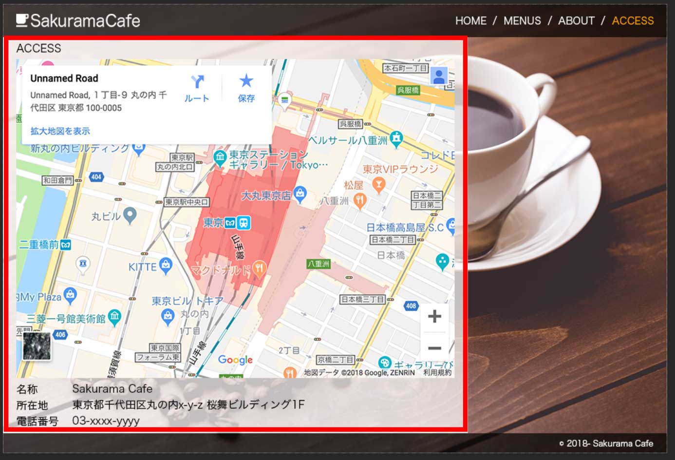
Building a Website from Scratch (6): Pre-Coding Preparation (Layout Planning and Reset CSS) - Images: Japanese
Hey there, everyone!
Picking up from last time — now that we have all our assets ready, let's get into the HTML and CSS coding.
First, go ahead and create a working folder (directory) somewhere convenient. We're building a website for "SakuramaCafe," so let's just name the folder 'sakuramaCafe'.
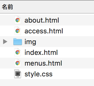
Inside that folder, we'll set up the files and subfolders we need. The basic structure is: at least one CSS file, one folder for images, and one HTML file per page.
The exact setup varies depending on the situation — if you want separate CSS files per page, you'd create more CSS files; if you're adding JavaScript, you'd add JS files; if you're using a dynamic language like PHP or Rails, you'd actually need fewer HTML files. But for this project, we're keeping things simple with just HTML and CSS, so we'll go with one CSS file, one image folder, and four HTML files.
As for naming conventions — the CSS file is almost always called 'style.css'. The author defaults to that name unless there's a specific reason not to.
The image folder is typically named img, image, or images. We'll go with img for this project.
For HTML files, the first page is always 'index.html'. The others are usually named after the page they represent, so we'll go with 'index.html' for the HOME page, 'menus.html' for the MENUS page, 'about.html' for the ABOUT page, and 'access.html' for the ACCESS page.
So the initial file structure looks like this:
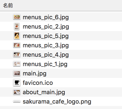
While we're at it, let's drop all the images we received into the img folder at once.
File structure: done.
While we have the momentum going, let's add the following line at the top of the CSS file. This declares the file as a UTF-8 encoded CSS file.
@charset "utf-8";
Now — this part is optional depending on your preference, but it's generally a good idea to load a 'reset CSS' at the very top. Reset CSS neutralizes all the default styles that browsers apply to HTML elements, which saves a lot of headaches later.
Here's the reset CSS the author uses. There are plenty of others out there, so feel free to use whichever one you like.
@charset "utf-8";

/* reset css start */
html, body, div, span, object, iframe, h1, h2, h3, h4, h5, h6, p, blockquote, pre, a, address, code, img, q, s,
small, strong, sub, b, i, dl, dt, dd, ol, ul, li, fieldset, form, label, legend, table, caption, tbody, tfoot, thead, tr, th, td,
article, aside, canvas, figure, figcaption, footer, header, hgroup, menu, nav, output, ruby, section, summary, time, mark, audio, video
{ margin: 0; padding: 0; border: 0; font: inherit; vertical-align: baseline;}
article, aside, details, figcaption, figure, footer, header, hgroup, menu, nav, section { display: block;}
ol, ul { list-style: none;}
table { border-collapse: collapse; border-spacing: 0;}
button { border: none; background-color: transparent; outline: none;}
/* reset css end */
This is purely the author's personal version — it does the bare minimum reset and nothing more. It may not match everyone's taste, so feel free to customize it or build your own. Writing your own reset CSS from scratch is actually good practice.
Next, let's add a couple more declarations:
html, body { height: 100%; font-family: sans-serif;}
body * { box-sizing: border-box;}
The height: 100% on html and body is a quirk you need to work around — without it, setting height: 100% on any child element won't actually fill the full browser height. Depending on the design, you may not always need this, but since almost every design has at least one element that should fill the browser height, it's usually easier to just include it upfront.
box-sizing: border-box is a CSS3 property that changes how element sizes are calculated — it tells the browser to include border and padding in the element's total width and height. For example, if an element has a height of 50px and you add a 2px border at the bottom, normally the total height becomes 52px. With box-sizing: border-box, it stays 50px. This makes size calculations much more predictable, so as long as you don't need to support very old browsers, the author recommends including it at the start.
We're also setting font-family at the same time. Since the design calls for a sans-serif font and we're fine using the default, we'll just write font-family: sans-serif for now. In a real project, you'd typically be more specific with the font stack.
Font-family specifications change quite a bit over time, so it's worth doing a quick search like "css font-family 2018" before implementing to make sure you're using current best practices.
Now, before we start writing any HTML or CSS, let's do some prep work to map out the design structure. This means identifying shared components and breaking the layout into blocks. Think of it as sketching out a rough plan before you start building.
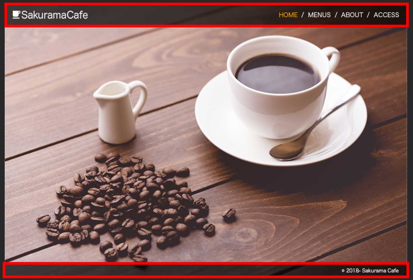
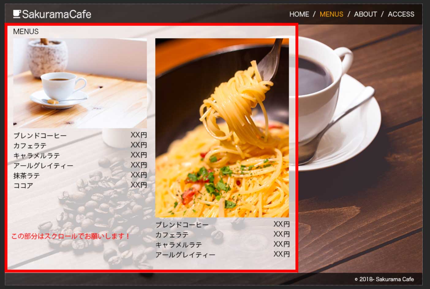
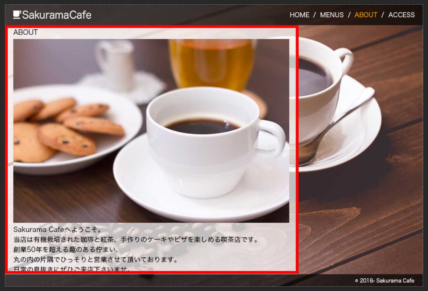
Looking at all the pages, you can see that the header and footer are consistent across all of them — only the middle section changes. The shared sections are highlighted in the red outlines below.
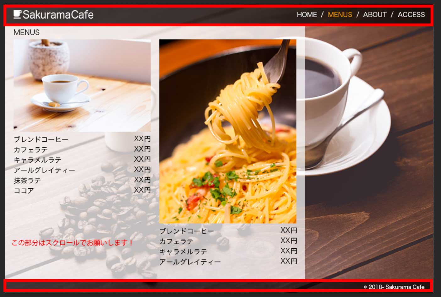
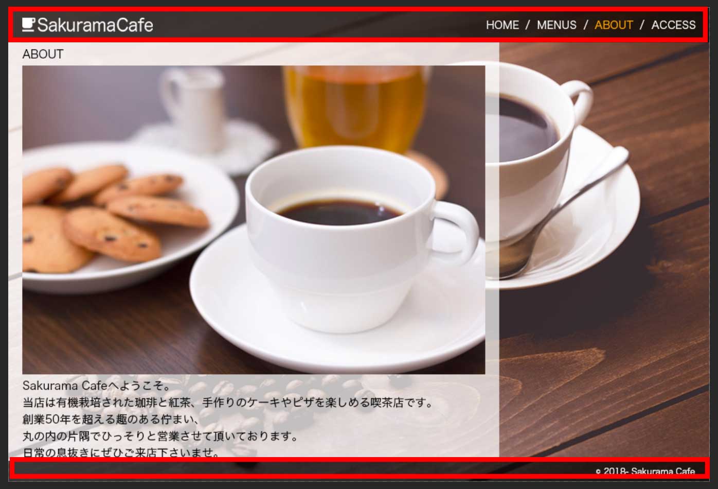
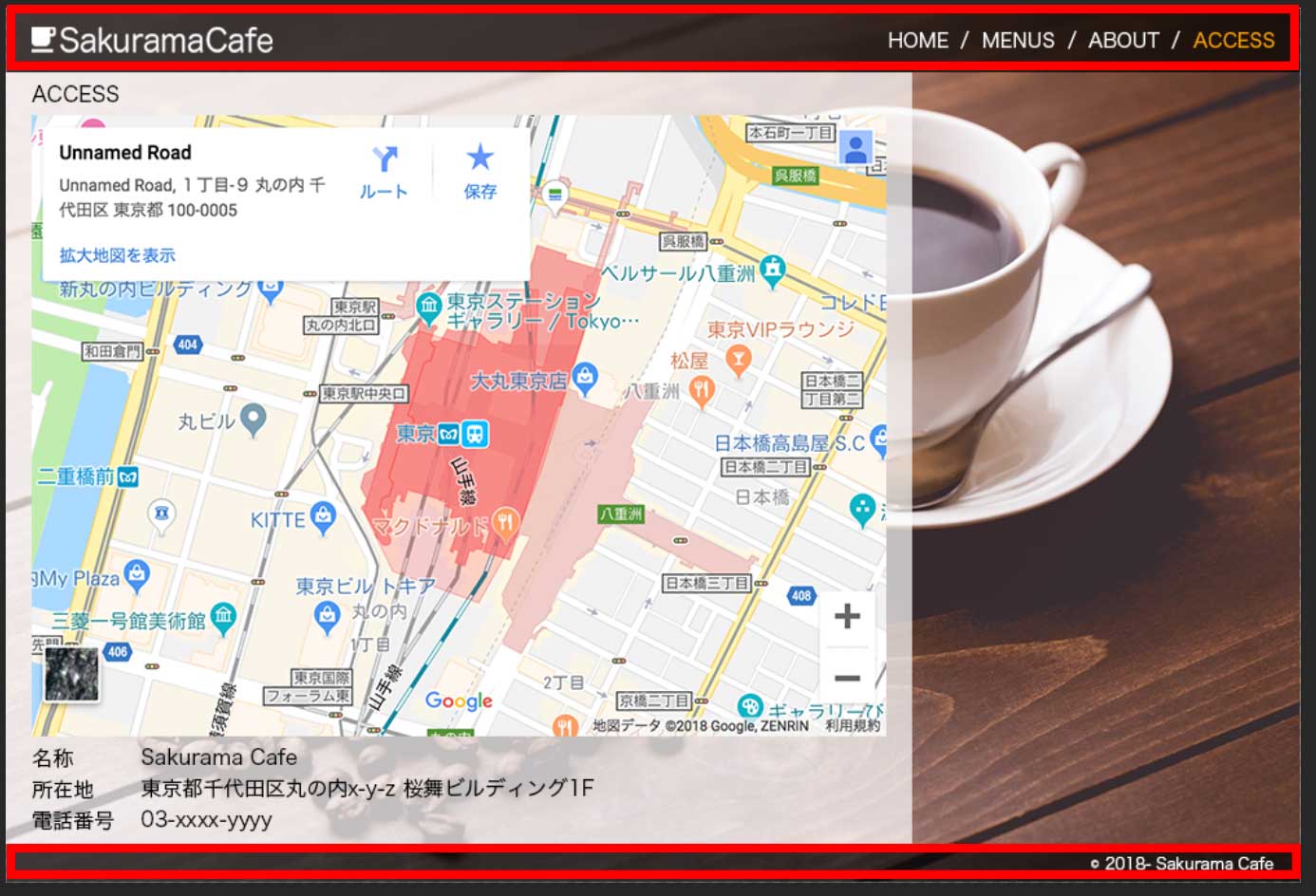
Additionally, three of the pages share a light white background section in the content area:
Taking stock of what's shared and what isn't before you start coding makes the whole process go much more smoothly. Get your layout blocks mapped out first.
Based on the design analysis above, 'index.html' is clearly the most fundamental page structure. So we'll start there and build the others by copying and modifying from it.
Let's paste the standard HTML5 boilerplate into index.html. Something like this:
<!DOCTYPE html>
<html lang="ja">
<head>
<meta charset="utf-8">
<title></title>
<link rel="stylesheet" href="./style.css">
</head>
<body>

</body>
</html>
The HTML boilerplate is pure copy-paste territory — no need to think about it. Keep a snippet of it saved somewhere handy.
Also note the CSS path. Since we're using a relative path, it's ./style.css — keep that in mind so you don't accidentally type the wrong thing.
Next, we'll start building out each section. The order is completely up to you — go with whatever feels natural or makes sense for the project.
In this case, we have all the assets ready from the start, so we can build in any order. On larger projects, though, certain designs or specs might be finalized late, so in those situations, it's usually best to start with the sections where all the materials are already in place.
For this project, we'll just go top to bottom. There's no particular reason for that — it's just the author's preference.
Here's something that often trips up beginners at this stage:
"I don't know which HTML element (tag) to use!"
For example, we're starting with the header section. Just off the top of your head, there are already a few different approaches:
Using a div element with an id:
<div id="header">

</div>
Using a div element with a class:
<div class="header">

</div>
Or using the header element introduced in HTML5:
<header>

</header>
In the next article, we'll go over how to choose between these options and what to watch out for. See you there!
This article was written by Sakurama.

Author's beloved small mammal |
桜舞 春人 Sakurama HarutoA Tokyo-based programmer who has been creating various content since the ISDN era, with a bit of concern about his hair. A true long sleeper who generally feels unwell without at least 10 hours of sleep. His dream is to live a life where he can sleep as much as he wants. Loves games, sports, and music. Please share some hair with him. |
If you find any errors or copyright issues, please contact us.