transition-timing-function
Specifies the 'timing and progression of the animation' for 'transition'.
Depending on the browser version, it may not work without vendor prefixes such as 'webkit', 'moz', 'ms', etc., so it is safer to include vendor prefixes when using this property. Also, note that the animation may be choppy depending on the PC specs.
Sample Code
transition: 0.5s;
-webkit-transition: 0.5s;
-moz-transition: 0.5s;
-ms-transition: 0.5s;

transition-timing-function: ease;
-webkit-transition-timing-function: ease;
-moz-transition-timing-function: ease;
-ms-transition-timing-function: ease;
Available Values
| Value | Effect |
|---|---|
| ease | Smooths the motion near the start and end. If 'transition-timing-function' is omitted, this 'ease' is applied by default. |
| linear | Changes at a constant speed. |
| ease-in | Slows down near the start of the animation. |
| ease-out | Slows down near the end of the animation. |
| ease-in-out | Slows down near both the start and end of the animation. |
| step-start | Immediately jumps to the final state. (No animation) |
| step-end | Remains in the initial state without changing. (No animation) |
Browser Display Result
div {
	background: #f00;
	width: 200px;
	transition: 1s;
	-webkit-transition: 1s;
	-moz-transition: 1s;
	-ms-transition: 1s;

	transition-timing-function: ease;
	-webkit-transition-timing-function: ease;
	-moz-transition-timing-function: ease;
	-ms-transition-timing-function: ease;
}
div:hover {
	width: 300px;
}
div {
	background: #f00;
	width: 200px;
	transition: 1s;
	-webkit-transition: 1s;
	-moz-transition: 1s;
	-ms-transition: 1s;

	transition-timing-function: linear;
	-webkit-transition-timing-function: linear;
	-moz-transition-timing-function: linear;
	-ms-transition-timing-function: linear;
}
div:hover {
	width: 300px;
}
div {
	background: #f00;
	width: 200px;
	transition: 1s;
	-webkit-transition: 1s;
	-moz-transition: 1s;
	-ms-transition: 1s;

	transition-timing-function: ease-in;
	-webkit-transition-timing-function: ease-in;
	-moz-transition-timing-function: ease-in;
	-ms-transition-timing-function: ease-in;
}
div:hover {
	width: 300px;
}
div {
	background: #f00;
	width: 200px;
	transition: 1s;
	-webkit-transition: 1s;
	-moz-transition: 1s;
	-ms-transition: 1s;

	transition-timing-function: ease-out;
	-webkit-transition-timing-function: ease-out;
	-moz-transition-timing-function: ease-out;
	-ms-transition-timing-function: ease-out;
}
div:hover {
	width: 300px;
}
div {
	background: #f00;
	width: 200px;
	transition: 1s;
	-webkit-transition: 1s;
	-moz-transition: 1s;
	-ms-transition: 1s;

	transition-timing-function: ease-in-out;
	-webkit-transition-timing-function: ease-in-out;
	-moz-transition-timing-function: ease-in-out;
	-ms-transition-timing-function: ease-in-out;
}
div:hover {
	width: 300px;
}
div {
	background: #f00;
	width: 200px;
	transition: 1s;
	-webkit-transition: 1s;
	-moz-transition: 1s;
	-ms-transition: 1s;

	transition-timing-function: step-start;
	-webkit-transition-timing-function: step-start;
	-moz-transition-timing-function: step-start;
	-ms-transition-timing-function: step-start;
}
div:hover {
	width: 300px;
}
div {
	background: #f00;
	width: 200px;
	transition: 1s;
	-webkit-transition: 1s;
	-moz-transition: 1s;
	-ms-transition: 1s;

	transition-timing-function: step-end;
	-webkit-transition-timing-function: step-end;
	-moz-transition-timing-function: step-end;
	-ms-transition-timing-function: step-end;
}
div:hover {
	width: 300px;
}
Browser Compatibility
 Chrome26+ ○
 25 △24 △23 △22 △21 △20 △19 △18 △
 Firefox16+ ○
 15 △14 △13 △12 △11 △10 △9 △8 △3 and earlier ×
 Safari9+ ○8 △
 7 △6 △5 △4 △2 and earlier ×
 Edge12+ ○
 IE11 ○10 ○9 ×
 8 ×7 ×
 6 ×
6 × Opera12.1+ ○
 10 and earlier ×
 iOS Safari9+ ○8 △7 △6 △5 △4 △3 △2 △1 and earlier ×
 Android Browser4.4+ ○3 and earlier × Chrome AndroidLatest ○ Firefox AndroidLatest ○
Details
Specifies the 'timing and progression of the animation' for 'transition'.
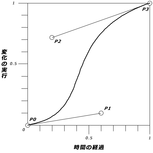
In addition to the preset values such as 'ease' and 'linear', you can also use 'cubic-bezier()' to specify the timing of changes in detail. This uses a cubic Bezier curve — also used in graphic software like Illustrator to draw curves — to specify the progression of the animation.
'cubic-bezier(P0, P1, P2, P3)'
Change the values 'P0', 'P1', 'P2', and 'P3' to vary the timing. The values must be between '0' and '1'; values outside this range are invalid.
div {
	background: #f00;
	width: 200px;
	transition: 1s;
	-webkit-transition: 1s;
	-moz-transition: 1s;
	-ms-transition: 1s;

	transition-timing-function: cubic-bezier(0.19, 1, 0.22, 1);
	-webkit-transition-timing-function: cubic-bezier(0.19, 1, 0.22, 1);
	-moz-transition-timing-function: cubic-bezier(0.19, 1, 0.22, 1);
	-ms-transition-timing-function: cubic-bezier(0.19, 1, 0.22, 1);
}
div:hover {
	width: 300px;
}
If you find any errors or copyright issues, please contact us.
 シェアする
シェアする