text-shadow
Specifies a shadow for text.
Sample Code
p.test { text-shadow: none;}
p.test1 { text-shadow: 1px 1px;}
p.test2 { text-shadow: 1px 0 2px red;}
p.test3 { text-shadow: 180px 0 #f00;}
p.test4 { text-shadow: 180px 0 red, 180px 10px green, 180px 20px blue, 180px 30px orange;}
Available Values
| Value | Description |
|---|---|
| none | No shadow on the text. This 'none' is the initial value. |
| number | Specifies the text shadow with numeric values. You can specify 'horizontal offset', 'vertical offset', 'blur radius', and 'shadow color'. Separate values with spaces. 'Blur radius' and 'shadow color' are optional. Use ',' to specify multiple shadows at once. |
Browser Display Result
<p style="text-shadow: none; font-size: 20px; text-align: center;">This is a p element.</p>
<p style="text-shadow: 1px 1px red; font-size: 20px; text-align: center;">This is a p element.</p>
<p style="text-shadow: 1px 1px 2px red; font-size: 20px; text-align: center;">This is a p element.</p>
Browser Compatibility
 Chrome2+ ○
 1 and earlier ×
 Firefox3.5+ ○
 2 and earlier ×
 Safari1.1+ ○
 Edge12+ ○
 IE11 ○10 ○9 ×
 8 ×7 ×
 6 ×
6 × Opera9.5+ ○
 8 and earlier ×
 iOS Safari1+ ○
 Android Browser4.4+ ○3 and earlier × Chrome AndroidLatest ○ Firefox AndroidLatest ○
Details
Specifies a shadow for text. This property was introduced in CSS3 and will not work in older browsers.
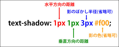
When specifying a shadow, you can set 'horizontal offset', 'vertical offset', 'blur radius', and 'shadow color', separated by spaces.
Note that the order matters: you must specify them as 'horizontal offset', 'vertical offset', 'blur radius', 'shadow color'. 'Blur radius' and 'shadow color' are optional.
For 'horizontal offset', a positive value moves the shadow to the right, and a negative value moves it to the left. The commonly used unit is 'px'. When specifying '0', no unit is required.
<p style="text-shadow: 180px 0 red; font-size: 20px; text-align: center;">This is a p element.</p>
<p style="text-shadow: -180px 0 red; font-size: 20px; text-align: center;">This is a p element.</p>
<p style="text-shadow: 1px 0 red; font-size: 20px; text-align: center;">This is a p element.</p>
Next is 'vertical offset'. A positive value moves the shadow downward, and a negative value moves it upward. The commonly used unit is 'px'. When specifying '0', no unit is required.
<p style="text-shadow: 0 50px red; font-size: 20px; text-align: center; margin-top: 80px;">This is a p element.</p>
<p style="text-shadow: 0 -50px red; font-size: 20px; text-align: center; margin-top: 80px;">This is a p element.</p>
<p style="text-shadow: 0 1px red; font-size: 20px; text-align: center; margin-top: 80px;">This is a p element.</p>
Next is 'blur radius'. The specified value makes the shadow appear lighter and wider. The commonly used unit is 'px'. This value is optional; if omitted, '0' is assumed. Negative values are not allowed.
<p style="text-shadow: 180px 0 0 red; font-size: 20px;">This is a p element.</p>
<p style="text-shadow: 180px 0 3px red; font-size: 20px;">This is a p element.</p>
<p style="text-shadow: 180px 0 10px red; font-size: 20px;">This is a p element.</p>
<p style="text-shadow: 0 0 10px red; font-size: 20px;">This is a p element.</p>
Next is 'shadow color'. You can specify it using a color code or color name, and 'rgba()' can also be used. Since designs typically prefer subtle shadows, semi-transparent colors using 'rgba()' are often used. 'Shadow color' is optional; if omitted, the same color as specified by the 'color' property is used.
<p style="text-shadow: 180px 0 0; font-size: 20px; color: green;">This is a p element.</p>
<p style="text-shadow: 180px 0 0 red; font-size: 20px;">This is a p element.</p>
<p style="text-shadow: 180px 0 0 #f60; font-size: 20px;">This is a p element.</p>
<p style="text-shadow: 180px 0 0 rgba(0, 0, 0, 0.5); font-size: 20px;">This is a p element.</p>
You can specify multiple shadows at once using ','. Note that the maximum number of shadows that can be generated simultaneously varies by browser. It is advisable to use four or fewer.
<p style="text-shadow: 0 -50px red, 180px 0 green, 0 50px blue, -180px 0 orange; font-size: 20px; text-align: center; margin-top: 80px;">This is a p element.</p>
When multiple shadows are generated at once, shadows listed earlier appear in front. Additionally, shadows are always rendered behind the original text and will never cover it.
<p style="text-shadow: 180px 0 red, 180px 10px green, 180px 20px blue, 180px 30px orange; font-size: 20px; margin-top: 80px;">This is a p element.</p>
Note that shadows generated by the 'text-shadow' property have no dimensions, so they do not affect the size of each element's content box.
If you find any errors or copyright issues, please contact us.
 シェアする
シェアする