box-shadow
Specifies the shadow of the content box.
Sample Code
p.test { box-shadow: none;}
p.test1 { box-shadow: 1px 1px;}
p.test2 { box-shadow: 1px 0 2px red inset;}
p.test3 { box-shadow: 250px 0 #f00;}
p.test4 { box-shadow: 250px 0 red, 250px 10px green, 250px 20px blue, 250px 30px orange;}
Available Values
| Value | Description |
|---|---|
| none | No shadow is applied to the content box. This 'none' is the initial value. |
| Number | Specifies the content box shadow using numbers. You can specify 'horizontal offset', 'vertical offset', 'blur radius', and 'color'. Values are separated by spaces. 'Blur radius' and 'color' are optional. Adding 'inset' applies the shadow to the inside. Multiple shadows can be specified simultaneously using ','. |
Browser Preview
<p style="box-shadow: none; border: solid 1px; font-size: 20px; text-align: center;">This is a p element.</p>
<p style="box-shadow: 1px 1px red; border: solid 1px; font-size: 20px; text-align: center;">This is a p element.</p>
<p style="box-shadow: 1px 1px 2px red; border: solid 1px; font-size: 20px; text-align: center;">This is a p element.</p>
<p style="box-shadow: 1px 1px 2px red inset; border: solid 1px; font-size: 20px; text-align: center;">This is a p element.</p>
Browser Support
 Chrome10+ ○
 9 △8 △7 △6 △5 △4 △3 △2 △
 Firefox4+ ○
 2 and earlier ×
 Safari5.1+ ○
 4 △3 △2 and earlier ×
 Edge12+ ○
 IE11 ○10 ○9 ○
 8 ×7 ×
 6 ×
6 × Opera10.5+ ○
 9 and earlier ×
 iOS Safari5+ ○4 △3 △2 △1 △
 Android Browser4.4+ ○3 and earlier × Chrome AndroidLatest ○ Firefox AndroidLatest ○
Overview
Specifies the shadow of the content box. This property was implemented in CSS3 and will not work in older browsers.
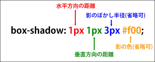
When specifying a shadow, you can set the 'horizontal offset', 'vertical offset', 'blur radius', and 'color', separated by spaces.
The order matters: you must specify them as 'horizontal offset', 'vertical offset', 'blur radius', 'color'. 'Blur radius' and 'color' are optional.
For the 'horizontal offset', a positive value moves the shadow to the right and a negative value moves it to the left. The commonly used unit is 'px'. If the value is '0', no unit is necessary.
<p style="box-shadow: 250px 0 red; border: solid 1px; width: 200px; font-size: 20px; text-align: center;">This is a p element.</p>
<p style="box-shadow: -250px 0 red; border: solid 1px; width: 200px; margin-left: 250px; font-size: 20px; text-align: center;">This is a p element.</p>
<p style="box-shadow: 10px 0 red; border: solid 1px; width: 200px; font-size: 20px; text-align: center;">This is a p element.</p>
Next is the 'vertical offset'. A positive value moves the shadow downward and a negative value moves it upward. The commonly used unit is 'px'. If the value is '0', no unit is necessary.
<p style="box-shadow: 0 50px red; border: solid 1px; width: 200px; font-size: 20px; text-align: center; margin-top: 80px;">This is a p element.</p>
<p style="box-shadow: 0 -50px red; border: solid 1px; width: 200px; font-size: 20px; text-align: center; margin-top: 80px;">This is a p element.</p>
<p style="box-shadow: 0 10px red; border: solid 1px; width: 200px; font-size: 20px; text-align: center; margin-top: 80px;">This is a p element.</p>
Next is the 'blur radius'. Specifying a larger value makes the shadow thinner and wider. The commonly used unit is 'px'. This is optional; if omitted, '0' is assumed. Negative values are not allowed.
<p style="box-shadow: 250px 0 0 red; border: solid 1px; width: 200px; font-size: 20px;">This is a p element.</p>
<p style="box-shadow: 250px 0 3px red; border: solid 1px; width: 200px; font-size: 20px;">This is a p element.</p>
<p style="box-shadow: 250px 0 10px red; border: solid 1px; width: 200px; font-size: 20px;">This is a p element.</p>
<p style="box-shadow: 0 0 10px red; border: solid 1px; width: 200px; font-size: 20px;">This is a p element.</p>
Next is the 'color'. You can specify it using a color code or color name, and 'rgba()' is also supported. Shadows are often displayed as subtle effects, so semi-transparent colors using 'rgba()' are commonly used. The 'color' is optional; if omitted, the same color as specified by the 'color' property is used.
<p style="box-shadow: 250px 0 0; border: solid 1px; width: 200px; font-size: 20px; color: green;">This is a p element.</p>
<p style="box-shadow: 250px 0 0 red; border: solid 1px; width: 200px; font-size: 20px;">This is a p element.</p>
<p style="box-shadow: 250px 0 0 #f60; border: solid 1px; width: 200px; font-size: 20px;">This is a p element.</p>
<p style="box-shadow: 250px 0 0 rgba(0, 0, 0, 0.5); border: solid 1px; width: 200px; font-size: 20px;">This is a p element.</p>
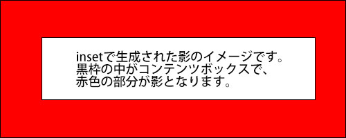
Adding 'inset' at the end applies the shadow to the inside of the content box. An 'inset' shadow is only visible within the content box; any portion that would exist outside is hidden. See the diagram below for a visual illustration of 'inset' shadows.
<p style="box-shadow: 10px 0 0 red inset; border: solid 1px; width: 200px; font-size: 20px;">This is a p element.</p>
<p style="box-shadow: 0 10px 0 red inset; border: solid 1px; width: 200px; font-size: 20px;">This is a p element.</p>
<p style="box-shadow: 0 0 5px red inset; border: solid 1px; width: 200px; font-size: 20px;">This is a p element.</p>
Using ',' allows you to specify multiple shadows simultaneously. Note that the maximum number of simultaneous shadows may vary by browser. It is safest to use four or fewer.
<p style="box-shadow: 0 -50px red, 220px 0 green, 0 50px blue, -220px 0 orange; border: solid 1px; width: 200px; margin: 0 auto; font-size: 20px; text-align: center; margin-top: 80px;">This is a p element.</p>
When multiple shadows are generated simultaneously, the stacking order is such that shadows listed earlier appear in front. The original content box is never covered by shadows; shadows appear behind the content box.
<p style="box-shadow: 250px 0 red, 250px 10px green, 250px 20px blue, 250px 30px orange; border: solid 1px; width: 200px; font-size: 20px; margin-top: 80px;">This is a p element.</p>
Note that shadows generated by the 'box-shadow' property have no physical size, so they do not affect the size of each element's content box.
If you find any errors or copyright issues, please contact us.
 シェアする
シェアする