border-bottom-left-radius
Specifies the radius of the bottom-left corner of an element.
You can specify the horizontal and vertical radii of the corner separately by separating them with a space. If the space is omitted, a uniform radius (perfect circle) is used.
Sample Code
div.test { border-bottom-left-radius: 50%;}
div.test1 { border-bottom-left-radius: 50px 25px;}
Available Values
| Value | Description |
|---|---|
| Number | Specifies a numeric value. Common units are『px』and『%』. When using『%』, the reference is the element's size (border box). The default value is『0』. |
Browser Preview
The background color of the samples below is『#00f』.
<div style="border-bottom-left-radius: 50%; background-color: #00f; margin: 0 auto; width: 100px; height: 100px;"></div>
<div style="border-bottom-left-radius: 50px 25px; background-color: #00f; margin: 0 auto; width: 100px; height: 100px;"></div>
Browser Compatibility
 Chrome4+ ○
 3 △2 △1 △
 Firefox4+ ○
 3 △2 △1 △
 Safari5+ ○
 4 △3 △2 and below ×
 Edge12+ ○
 IE11 ○10 ○9 ○
 8 ×7 ×
 6 ×
6 × Opera10.5+ ○
 9 and below ×
 iOS Safari4.2+ ○3 △2 △1 △
 Android Browser4.4+ ○3 and below × Chrome AndroidLatest ○ Firefox AndroidLatest ○
Notes
Specifies the radius of the bottom-left corner of an element.
When using『%』, the reference value is the element's size (border box).
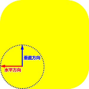
You can set the horizontal and vertical radii individually by separating them with a space. The value before the space is the horizontal radius, and the value after is the vertical radius. This allows the corner to be rounded with an ellipse rather than a perfect circle. If the space is omitted, a uniform radius (perfect circle) is used.
/* div { border-bottom-left-radius: horizontal vertical;} */
div.test { border-bottom-left-radius: 50% 25%;}
Note that some older Android stock browsers have a bug where specifying a『%』value for『border-bottom-left-radius』may not render correctly.
If you find any errors or copyright issues, please contact us.
 シェアする
シェアする